projects
Building My Personal Website
Designing a minimal publishing system that is simple to maintain and easy to expand.
There is a huge difference between a portfolio website and a writing system.
I wanted something quiet and durable: a place to publish work notes, travel stories, and personal reflections without adding more tooling than the content itself required.
Why Astro fit
The static-first nature of Astro makes it ideal for this kind of site. I can write in Markdown, keep content close to the project, and ship a fast website with almost no moving parts.
The challenge was designing the architecture so that adding a new post stays simple enough that it feels natural.
The publishing principle
The site is built around content collections, not custom CMS logic. That keeps the workflow honest: create file, add metadata, write the post, commit and publish.
This small rule reduces complexity in a way that actually improves long-term maintenance.
What I want from the site
I wanted the pages to feel editorial rather than product-like.
That meant spending more attention on whitespace, rhythm, and typography than on flashy visual elements. The goal was to create a space that invited reading.
Using real reference assets
Before finalizing the structure, I used a few design mockups as references for balance, hierarchy, and tone. These were not final screens, but they were useful anchors for the visual direction.
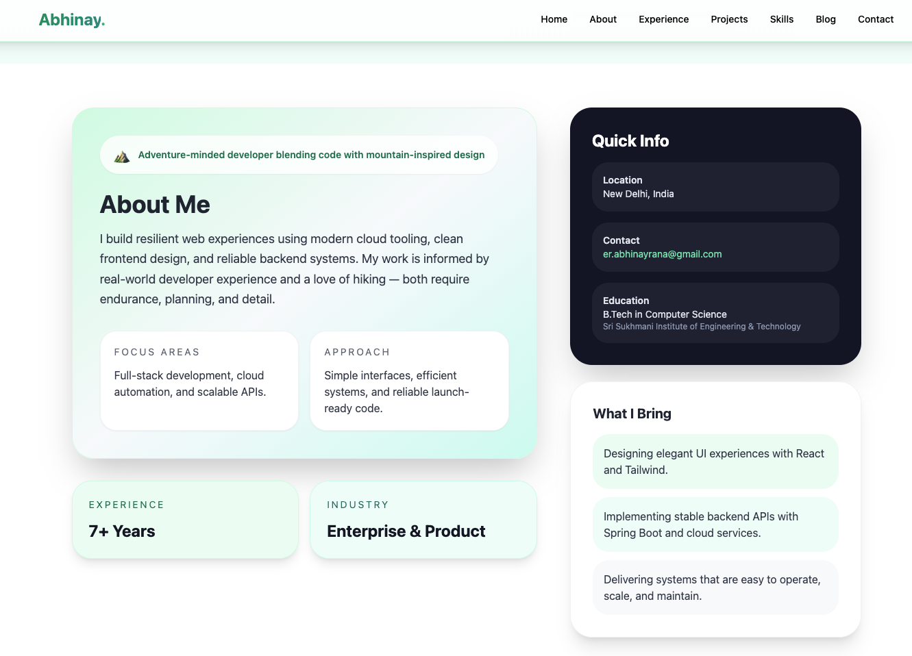
The about panel needed to feel warm and confident without becoming noisy. The goal was to keep the text calm while still giving the page enough personality to feel like a real person was behind it.
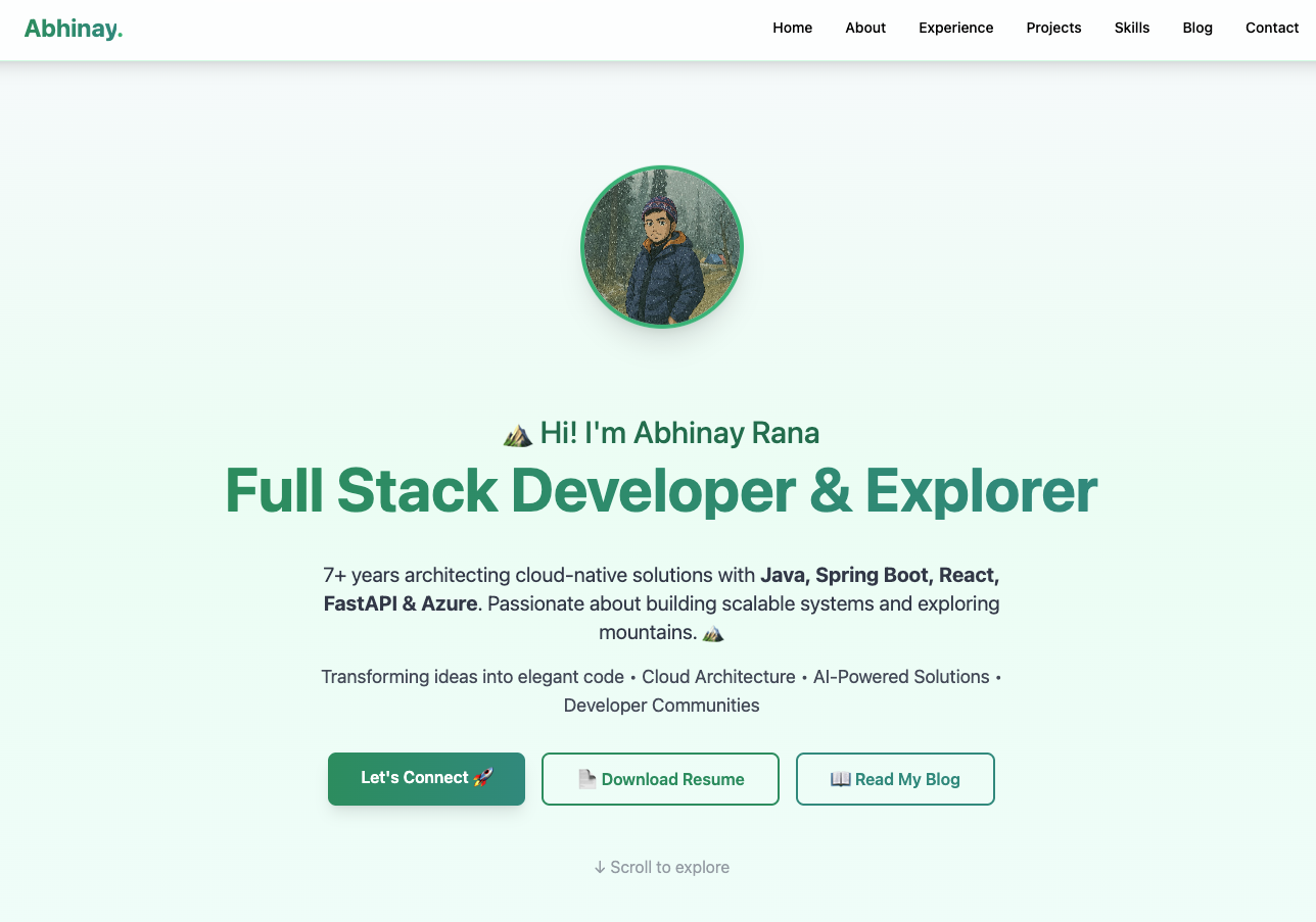
The hero section needed to communicate a clear identity immediately: who I am, what I build, and why the work matters. The composition had to remain minimal, but still grounded in a believable product aesthetic.
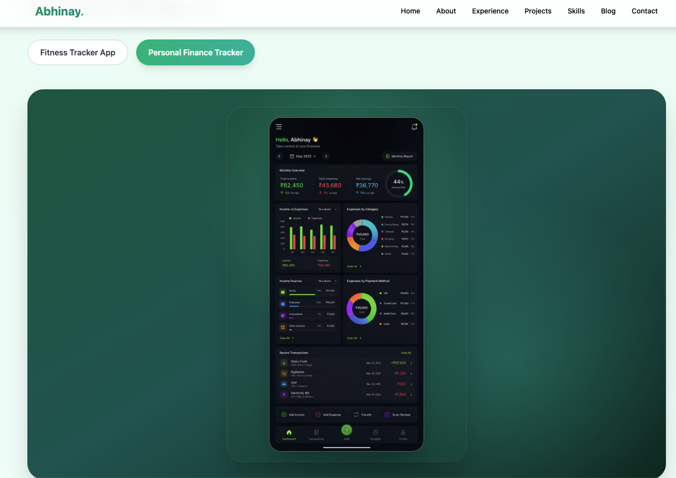
I also used product-style mockups as examples of how a project case study could feel when presented within a personal portfolio. The idea was to keep the presentation honest and useful, while preserving the quiet tone of the site.
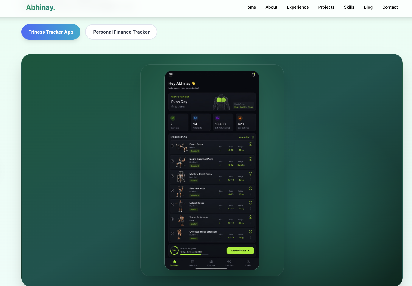
These examples became useful reference points for layout density, spacing, and how much visual personality was appropriate before the site crossed into something too busy.
The result is a blog and portfolio system that feels grounded in real decisions instead of generic template aesthetics.